From brand creation to roll-out.

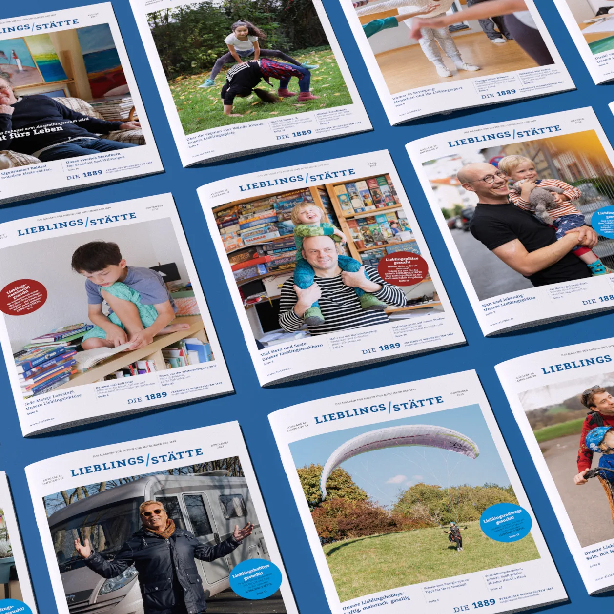
Snapshots
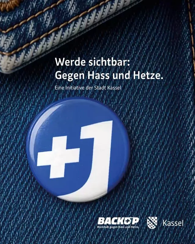
The foundation for BACKUP was developed in a joint workshop with the City of Kassel and its residents. Machbar condensed the idea into a campaign concept and created the simple, recognisable +1 symbol: those who visibly wear it show they are observant, present, and approachable when someone needs support. This transforms an attitude into a promise: you are not alone.
Machbar developed the entire campaign presence – from billboards, pins, and flyers to the microsite and social media, including the concept for the launch event at BALi. Distribution points and individuals visibly wearing the symbol create a growing network for greater support in Kassel.ClientCity of Kassel, Office for Equal OpportunitiesServicesNaming and brand language Workshops & Innovation Corporate design Editorial & print Websites & digital products Film, motion & 3D Content & social media Internal communication & changekassel.de/backup

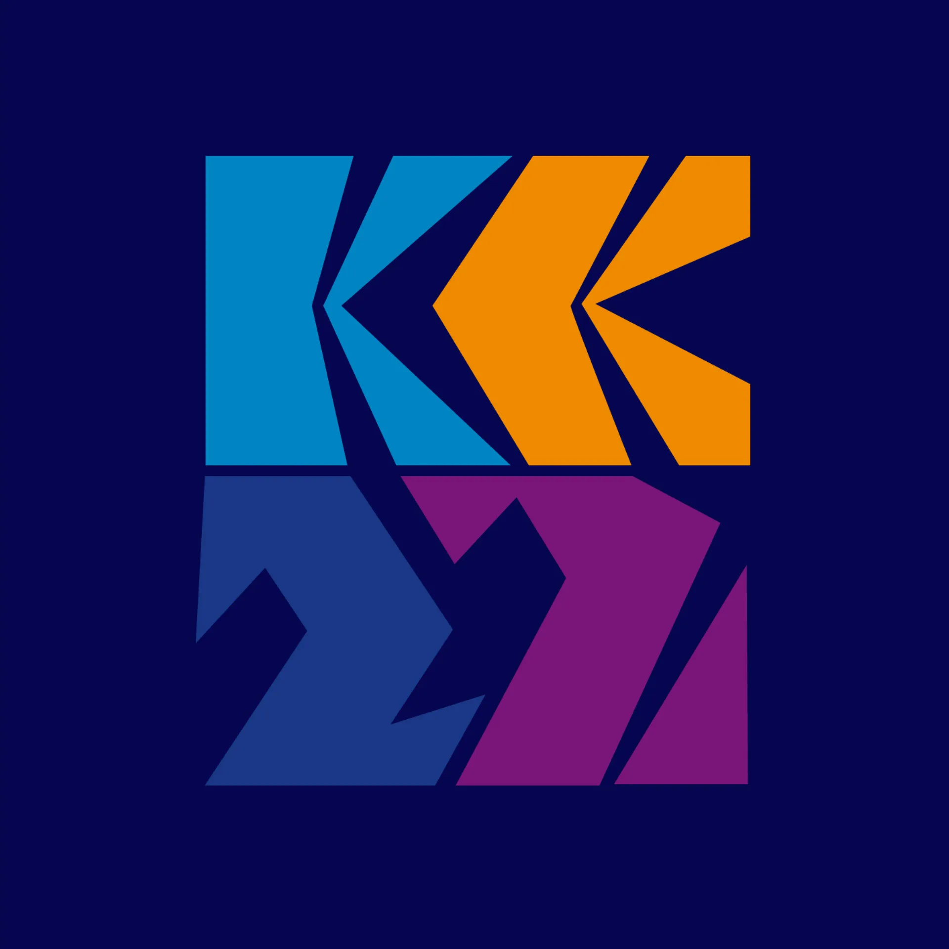
GRIMMWELT Kassel brings the work of the Brothers Grimm to life, from their fairy tales to their linguistic research. In 2025, GRIMMWELT celebrated two anniversaries: ten years since its opening and 20 years since the Brothers Grimm's personal copies of the Children's and Household Tales were inscribed on the UNESCO Memory of the World Register. Machbar developed an anniversary campaign rooted in the existing logo. Two additional strokes transform its lines into the number ten. This subtle intervention gives new meaning to a familiar symbol, visually uniting both anniversaries while evoking the Brothers Grimm's handwritten annotations. Under the theme "Weitererzählen" (Keep telling the story), fairy tale motifs meet bold colours and playful animation. The campaign thus connects the Brothers Grimm's scholarly legacy with an invitation for visitors to explore it themselves. Because ten years of GRIMMWELT is just the beginning.
ClientGRIMMWELT Kassel![Several tablets on an orange background show marcapo websites with Stihl and Heroes logos.]()
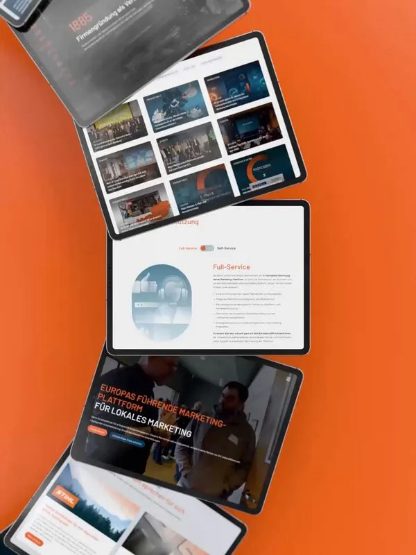
marcapo unifies central brand management with local marketing for retailers, partners, and locations. For the new website, we evolved the existing corporate design for digital platforms and translated the complex offering into a clear, animated narrative. The trilingual TYPO3 platform features a modular structure, enabling the marcapo team to independently develop content and pages. This is particularly evident in the scroll choreography, which explains step-by-step how local partners select and deploy campaigns.
Clientmarcapo GmbHmarcapo.com
![Grimme Online Award 2026 nominee]()
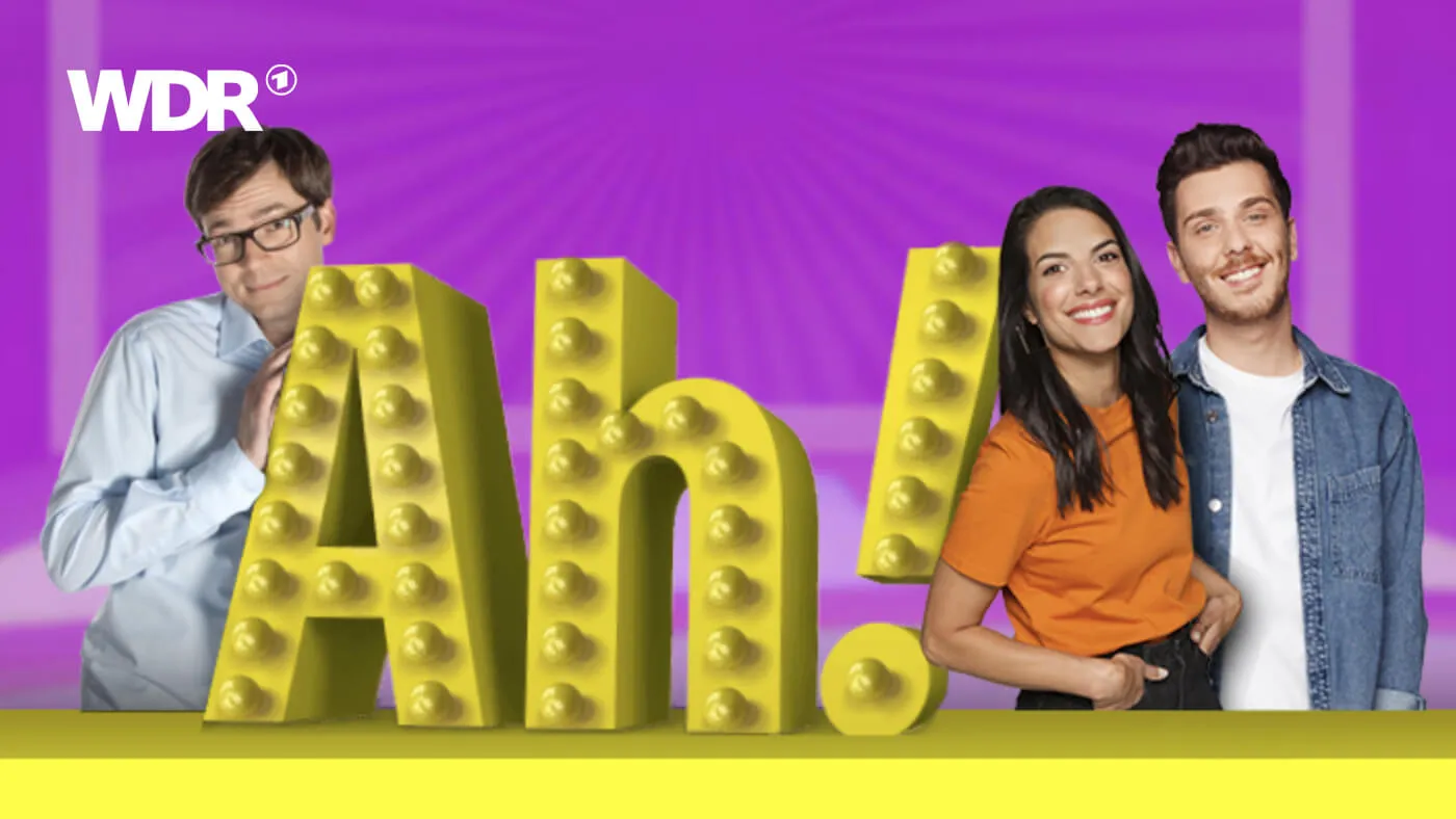
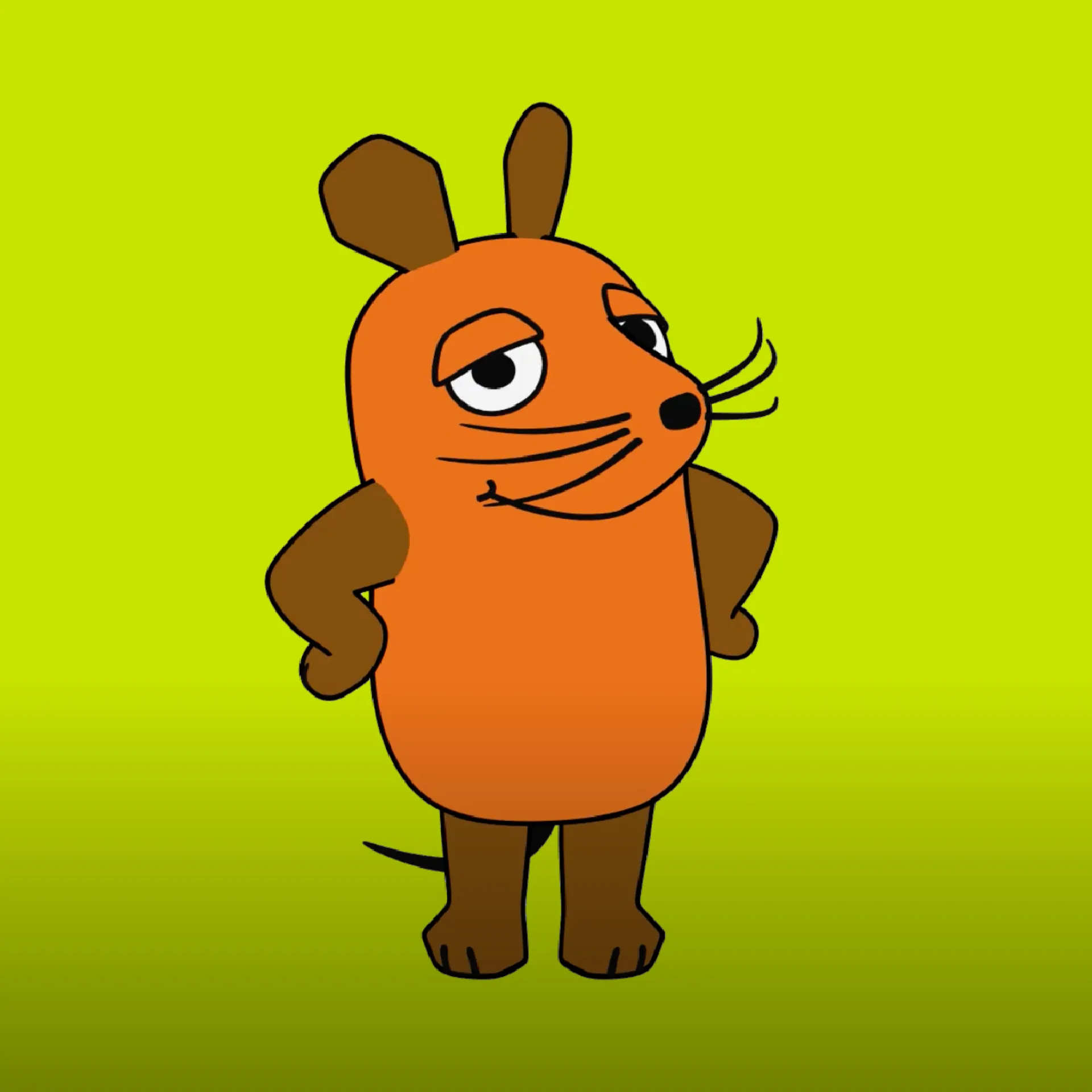
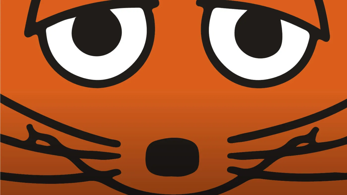
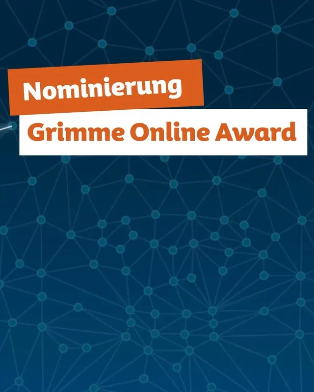
We are delighted to receive this special recognition for the third time. Following the award for 'Wissen macht Ah!' and the MausApp nomination, the Maus theme page is now nominated for the Grimme Online Award. This time, the focus is on Artificial Intelligence, a topic we have long been engaged with. As long-standing agency partners, machbar played a key role in the concept, ideas, and technical implementation of this significant WDR project. We have supported Die Maus and its digital formats for many years, and we are consistently proud to be part of this unique journey. Our thanks to the excellent Maus team at WDR for their trust and inspiring collaboration.
ClientWDR - Westdeutscher Rundfunk, CologneServicesWebsites & digital products Film, motion & 3DInteractive applicationsContent & social mediawww.wdrmaus.de
![A young man in a dark blue knitted hat and hoodie holds a glittering chain with the Kassel coat of arms up to the camera.]()
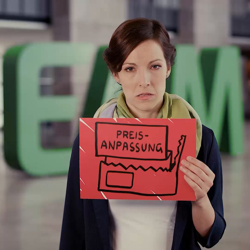
Städtische Werke supplies Kassel with energy and operates its swimming pools. As a municipal company, it is deeply connected to the city and its people. Machbar has given this connection a face over many years. The "Pride and Prejudice" campaign made local self-confidence a programme. We further developed the corporate design and brought the brand to trams, advertisements and the web. Everyday product communication also received a consistent system – from packshots to invoice inserts.
ClientStädtische Werke AGServicesPositioning & brand architecture Naming and brand language Workshops & Innovation Corporate design Editorial & print Websites & digital products Film, motion & 3D Campaigns Internal communication & changesw-kassel.de
![Logo of Volksbund Deutsche Kriegsgräberfürsorge e.V. with three crosses and the slogan "United for peace." on white paper.]()
In 2017/18, to mark its 100th anniversary, Machbar redesigned the logo and developed a new brand identity for Volksbund Deutsche Kriegsgräberfürsorge (German War Graves Commission). The five crosses were retained as a powerful symbol of remembrance, detached from their previous form, and combined with the name and new slogan "United for peace." to create a clear, unified identity. The name describes the organisation's mission, while the slogan expresses its shared goal: peace as an ongoing process that requires active engagement.
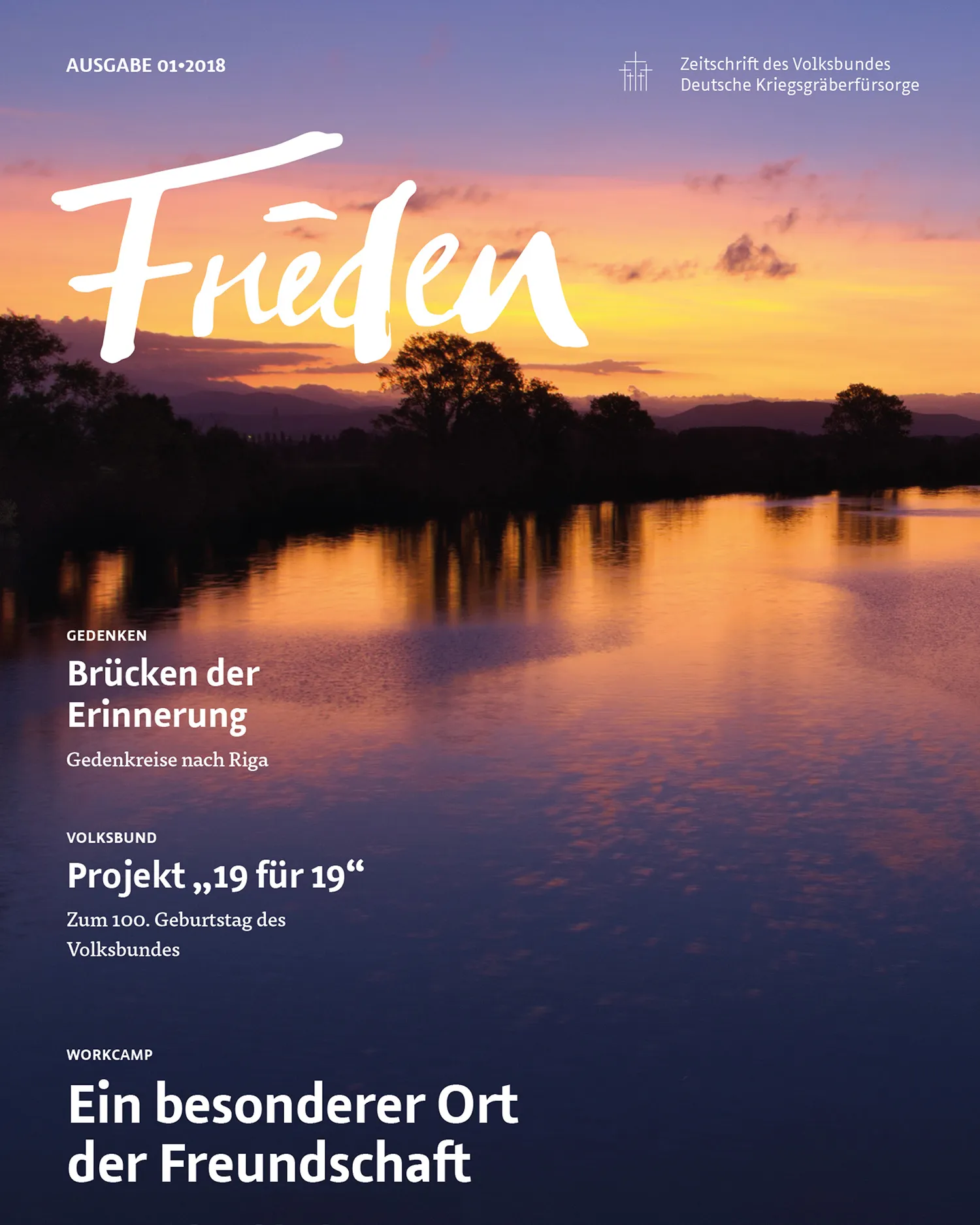
The new corporate design unified the organisation's communications, from stationery, flags, plaques, and giveaways to invitations and programmes for Remembrance Day. The magazine "Frieden" (Peace) also received a new editorial and design system.ClientVolksbund Deutsche Kriegsgräberfürsorge e. V.ServicesPositioning & brand architecture Naming and brand language Corporate design Editorial & print Campaignsvolksbund.de
![Close-up of silver threaded fittings with the white lettering "LANDEFELD" above.]()
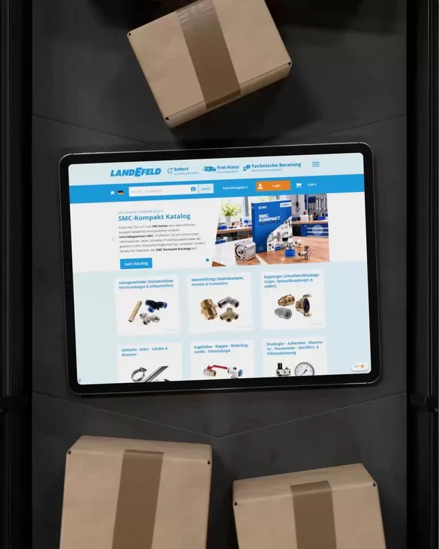
Landefeld is a supplier of pneumatic, hydraulic, and industrial components. The company's unique success is based on defining every aspect of its business as a substantial part of its purpose. This ranges from a fully automated high-bay warehouse, stocking no fewer than 300,000 items, to world-leading distribution logistics. No detail escapes the highest management attention. This also applies to the online shop, for which we meticulously choreographed every possible click path.
ClientLandefeld Druckluft und Hydraulik GmbHlandefeld.de
![The GASCADE logo on a rectangle with blue and red stripes, overlaid on a background of stacked pipeline pipes.]()
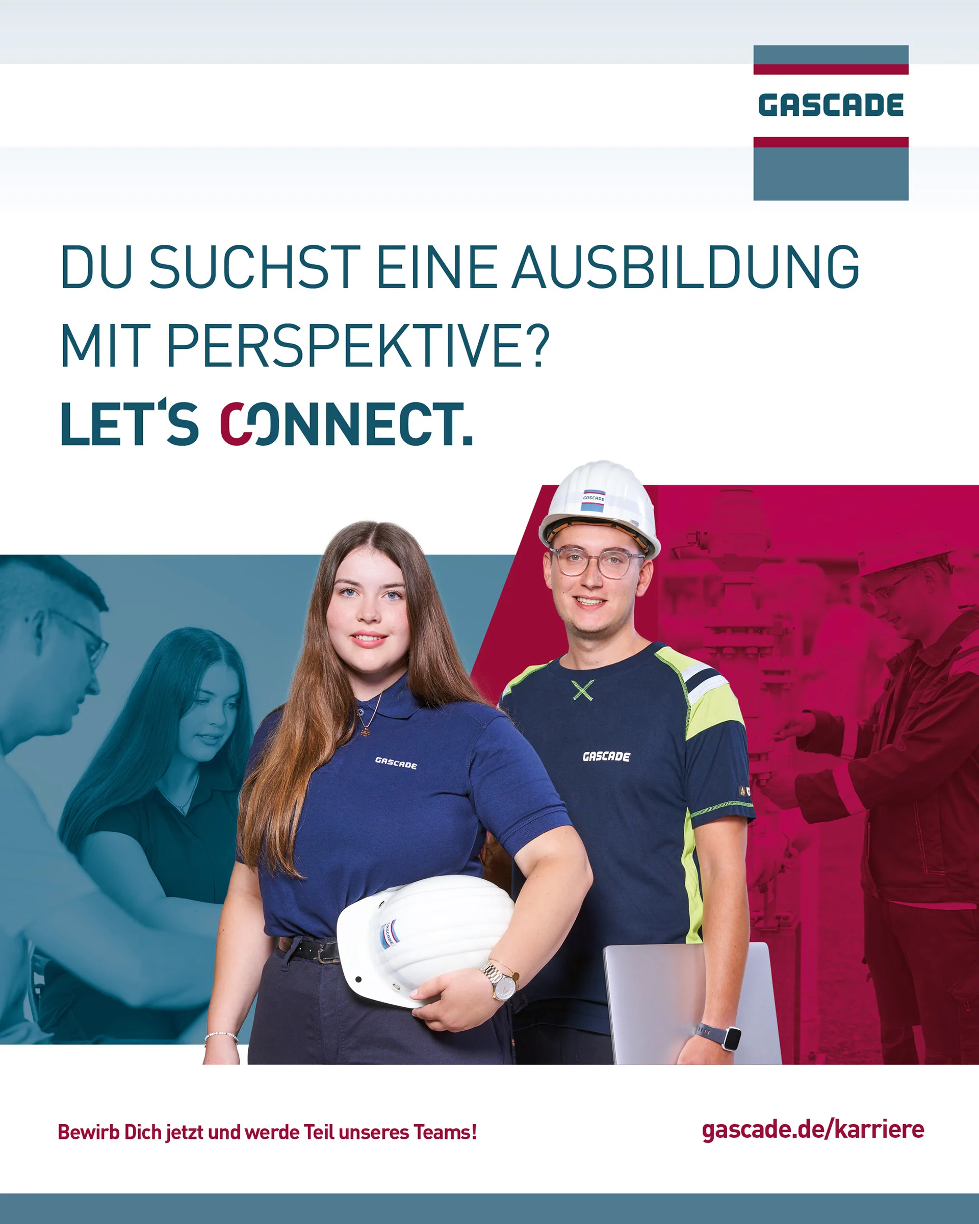
Kassel-based GASCADE is one of Germany's largest long-distance gas pipeline network operators. The company connects countries and energy supplies, requiring a diverse workforce.
machbar has supported GASCADE since 2012, providing services from corporate design and company publications to photography. We developed the "LET'S CONNECT" employer campaign to align candidate aspirations with GASCADE's opportunities. The core idea is embedded in the lettering: the red 'C' transforms into a pipe connector. Employees feature prominently in the campaign, sharing their experiences in videos. From apprenticeship advertisements and target-group-specific flyers to recruitment fair stands and career website graphics, "LET'S CONNECT" unifies all touchpoints into a cohesive employer brand.ClientGASCADE Gastransport GmbHServicesPositioning & brand architecture Naming and brand language Workshops & Innovation Corporate design Editorial & print Websites & digital products Film, motion & 3D Campaigns Content & social media Internal communication & changekarriere.gascade.de
![The word "SCIENCE PARK" in magenta on a grey concrete background, with the brand logo cropped on the right.]()
As a spin-off from the University of Kassel, machbar was ideally placed to help the Science Park establish itself as a hub for start-ups, networking, and business growth. We developed the name, strapline, and corporate design, applying them to a wide range of communication tools, from posters and print materials to the website. Covering 6,000 square metres, the Science Park combines offices, studios, workshops, laboratories, co-working spaces, and a large Idea Lab with start-up advice from UniKasselTransfer. The brand identity presents it not just as a building, but as a platform that supports business ideas from initial concept to successful launch.
ClientScience Park KasselServicesPositioning & brand architecture Naming and brand language Workshops & Innovation Corporate design Editorial & print Websites & digital products Campaignsscience-park.de
![Klärschilf logo with the slogan 'naturally dewater', alongside reeds and a dragonfly against a light blue background.]()
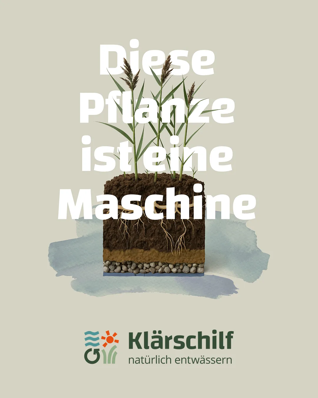
Klärschilf is the new brand name for THE PAULY GROUP's established method of natural sludge dewatering in reed beds. The term also refers to the reeds themselves, which are a central element of the process. The new word and figurative mark combines symbols of natural processes, technical precision, and ecological responsibility.
ClientTHE PAULY GROUPServicesPositioning & brand architecture Naming and brand language Workshops & Innovation Corporate design Editorial & print Websites & digital productsExhibitions and spacesFilm, motion & 3D Campaigns Content & social media Internal communication & changeklärschilf.de
![Ambion illustration: a person doing a handstand on a beam, surrounded by perspective lines and frames on a black background.]()
Ambion, based in Kaufungen near Kassel, plans and delivers event technology, digital media installations, and live productions for concerts, trade fairs, and corporate events worldwide.
machbar developed the Ambion name and strapline, and designed the comprehensive rebranding for the company, which had been established for ten years. A consistent new brand identity was created, from business stationery and the website to elaborately produced image books and other communication materials.
Employees naturally refer to themselves as Ambionauts. The only remaining question is: how is the coined word Ambion actually pronounced?ClientAmbion GmbHServicesPositioning & brand architecture Naming and brand language Corporate design Editorial & print Websites & digital products Film, motion & 3D Campaigns Content & social media Internal communication & changeambion.de
![A Sartorius Cubis laboratory device with a touchscreen display and keypad on a reflective surface.]()
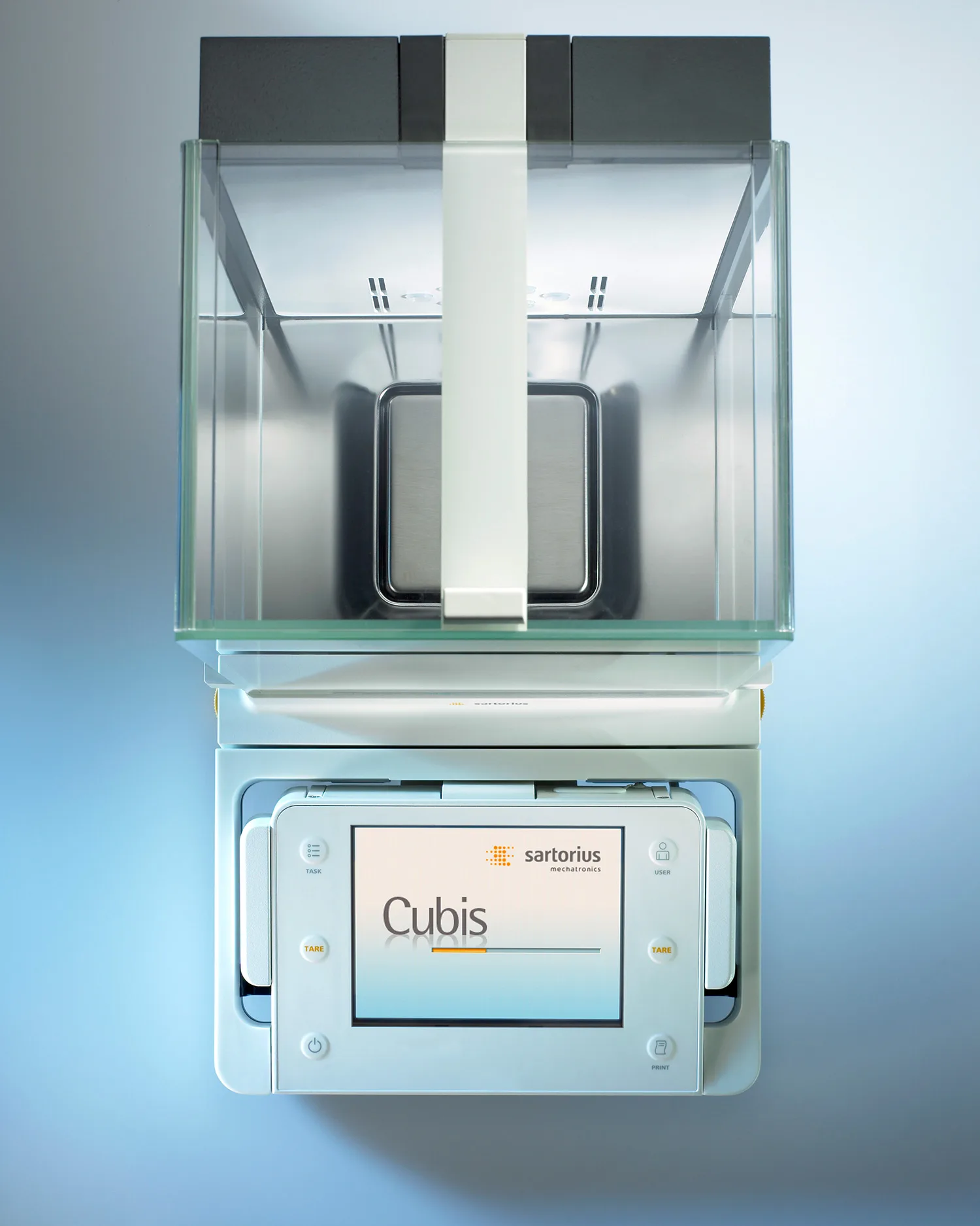
Admittedly, the most responsive element in this digital project was the scales themselves. The rest involved pixel-perfect craftsmanship and UI excellence. machbar designed the user interfaces and membrane keypads for the first fully modular Cubis laboratory balance series for Sartorius. These balances were freely configurable, adaptable to changing applications, and designed for regulated areas of the pharmaceutical industry.
The Q-Guide operating concept displayed only the options required for the current task, guiding users quickly and accurately through complex workflows.
machbar also supported the market launch with the core idea "Cubis. The new benchmark." This work was part of a long-standing collaboration with Sartorius, which included product and image brochures, campaigns, and annual reports.ClientSartorius AGServicesWorkshops & Innovation Corporate design Editorial & print Websites & digital products Campaigns Content & social mediasartorius.de
![The white Hübner logo on a background detail shot of a bellows, as used in buses and trains.]()
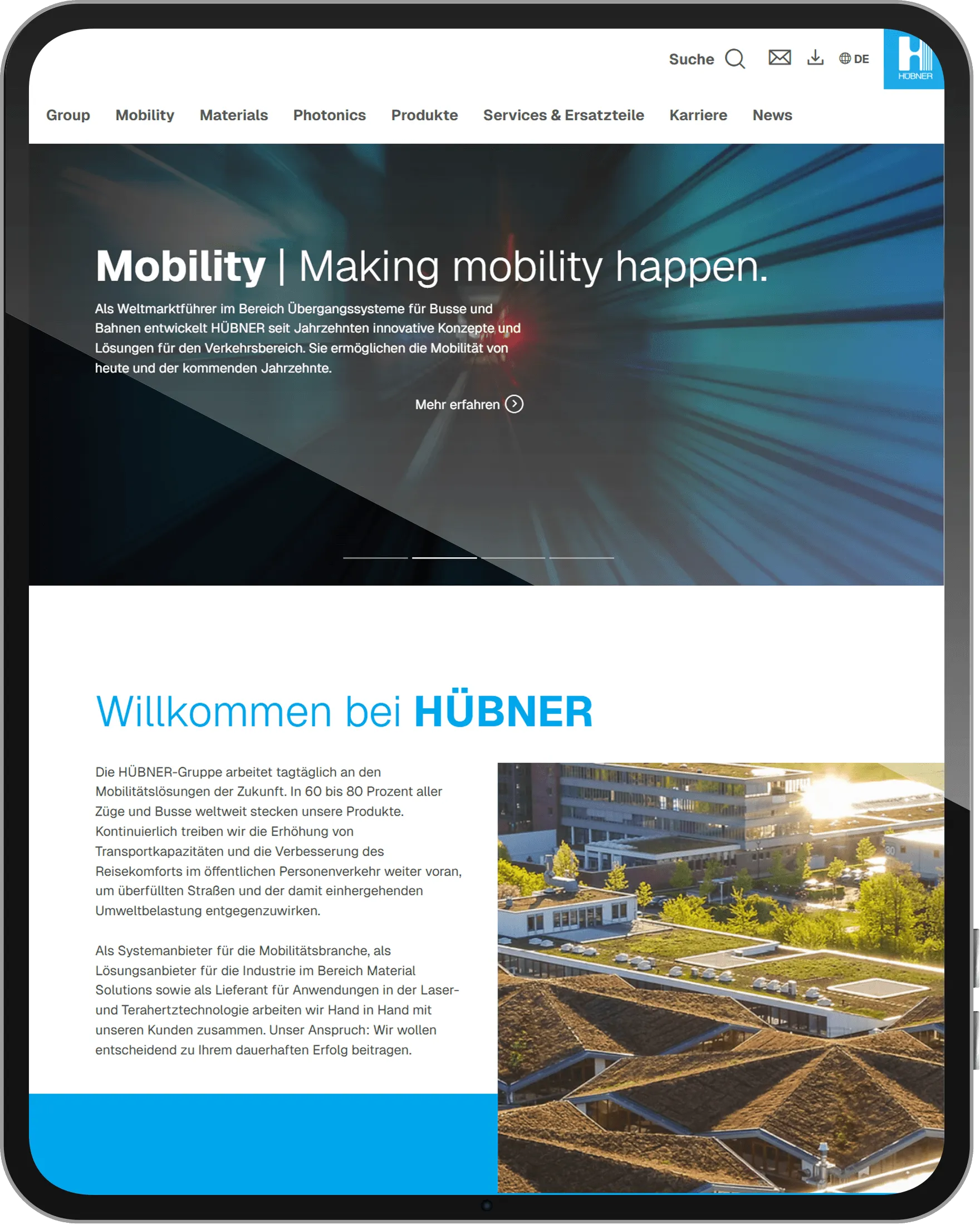
Based in Kassel, HÜBNER is the global market leader for gangway systems for buses and trains. The company also develops technical products from rubber and plastics, and its Photonics division specialises in laser, terahertz, and high-frequency technology. The brand encompasses a wide range of products, technologies, and applications. Since 2004, machbar has organised and visualised this diversity, creating a cohesive communication strategy. This has included a revised corporate identity, an extensive multilingual brochure system, and multiple generations of websites. We have also developed product names, advertisements, and exhibition graphics, alongside over 3,000 photographs that capture both technical details and the entire portfolio. machbar also conceived, designed, and implemented the current TYPO3 website. From individual components to the digital product world, we have created a unified presence for everything that defines HÜBNER.
ClientHÜBNER GmbH


Our story so far.
Over 500 clients across all sectors. From brand creation and rollout to ongoing support, encompassing all essential analogue and digital components.